 You’ve probably seen the work of Alex Toth, if not in its original context, then in its repurposed format as Space Ghost Coast to Coast, Harvey Birdman, or Sealab 2021. He designed those characters, along with a number of others, for Hanna-Barbera, in the ‘60s and ‘70s.
Toth (rhymes with “both”) was also an accomplished comics storyteller, but unlike his contemporaries, he never spent a long time on a single title or with a single company. Even in the current golden age of comic book reprints, you’ll find more books about Toth in a bookstore than books by Toth. To find him, one must resort to the venerable tradition of crate-diving.
This whole escapade started with a dollar copy of Black Hood #2 and an amiable guy behind the counter of my favorite comic/junk store, The Nostalgia Zone. “You like Toth? We got lots of it.” He pulled out flawless, magazine-sized books with crisp black-and-white art. They had price stickers on the front with handwritten comments. Nice Toth. Great Toth. 6 Pages Nice Toth. By the time I left, I had a whole bundle of cheap comics from the ‘60s, ‘70s, and ‘80s. In chronological order, then, let’s take a look at Alex Toth.
One of Toth’s most sustained projects was pencilling Zorro comics for Disney. Even this early, Toth’s proficiency with body language and character design are on full display. The panels are often much, much busier than they are his later work, though. Look at all those crosshatched lines on the wall around the woman. What purpose do they serve?
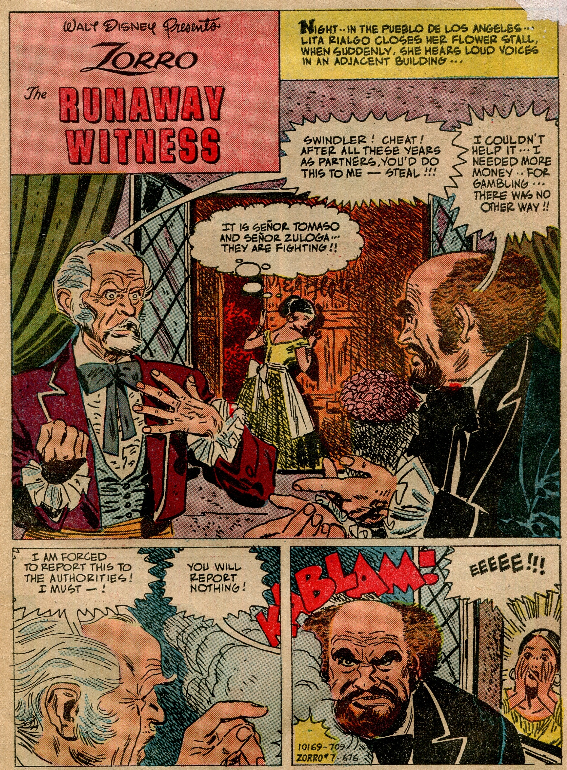
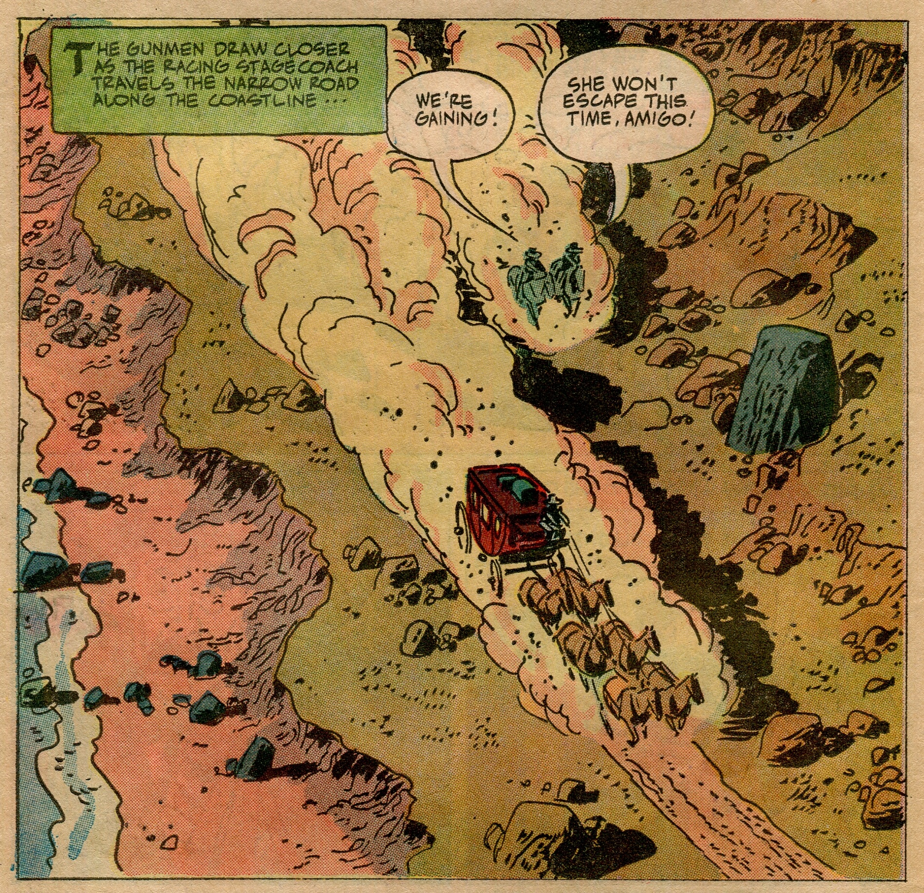
When Toth pulls away for the long shot below, though, you can see his tendency towards abstraction. The rocks, the dust, and the people and horses are indicated with spare linework and messy blacks—just enough to tell a reader what’s going on.
The storylines are bland but cathartic: Zorro is dashing without being sexy, rebellious without being political; good wins out over evil and people learn the error of their ways. This was apparently the kind of story Toth wanted to tell—swashbuckling adventure with simple, Errol Flynn morality. It was how he thought the world was (or at least how it should be).
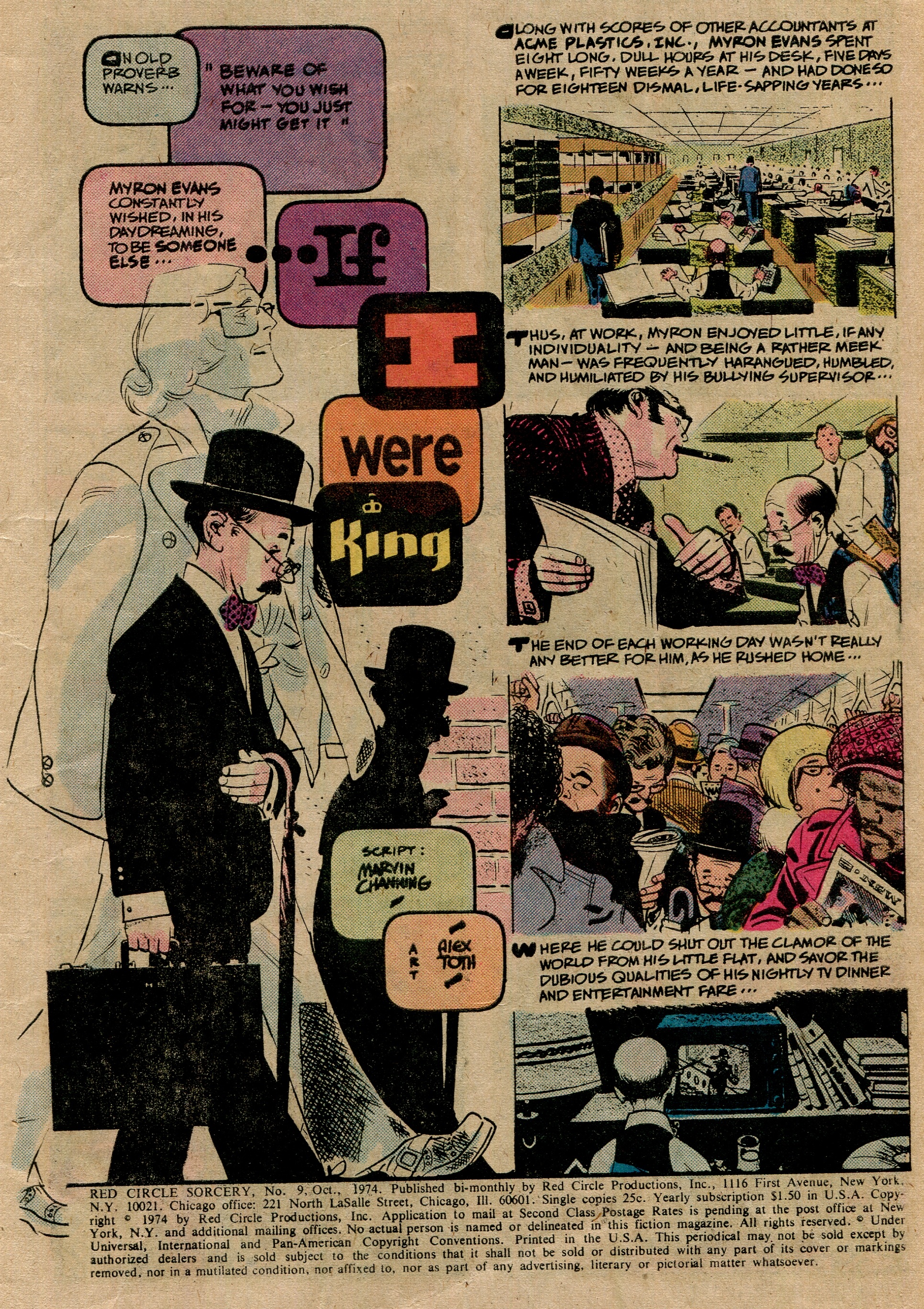
Flashing forward about 10 years, we find Toth in Sorcery #9 (Red Circle Comics, a division of Archie). Perhaps inspired by his time in animation, Toth’s distinctive lettering is evolving, becoming part of the page:
Gone are the pointlessly busy crosshatchings that filled the space of his Zorro work. It’s replaced by brave chunks of black. However, Toth can still whip out the obsessive detail when it serves the story. Compare the two panels below.


While both women’s rooms are stuffed with, well, stuff, the differences are striking and contribute to defining them as characters without wasting space on exposition-via-narration.
And another decade forward, in 1983, we come back to Black Hood #2, where Toth writes and draws an 8-page story about a black-suited character named The Fox. His lines have become thicker and shorter, almost impressionistic, and more and more of his panels fill up with black. Concise, economic lines inside swaths of negative space become the rule.
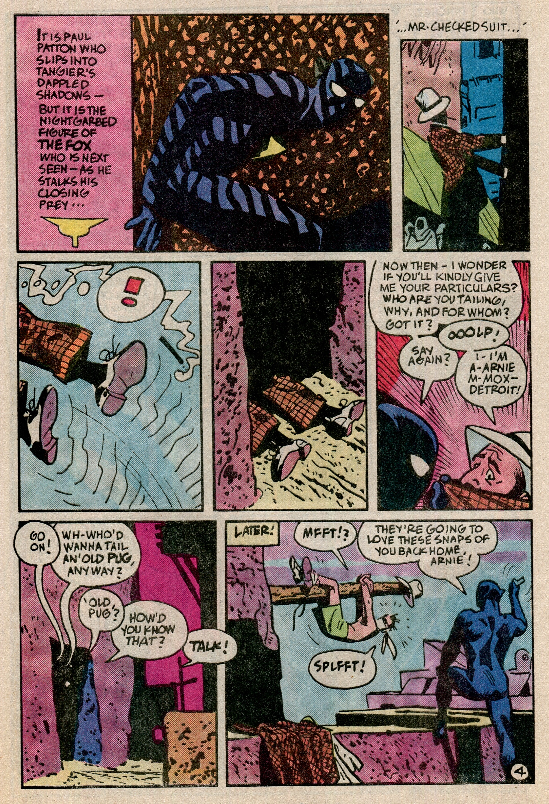
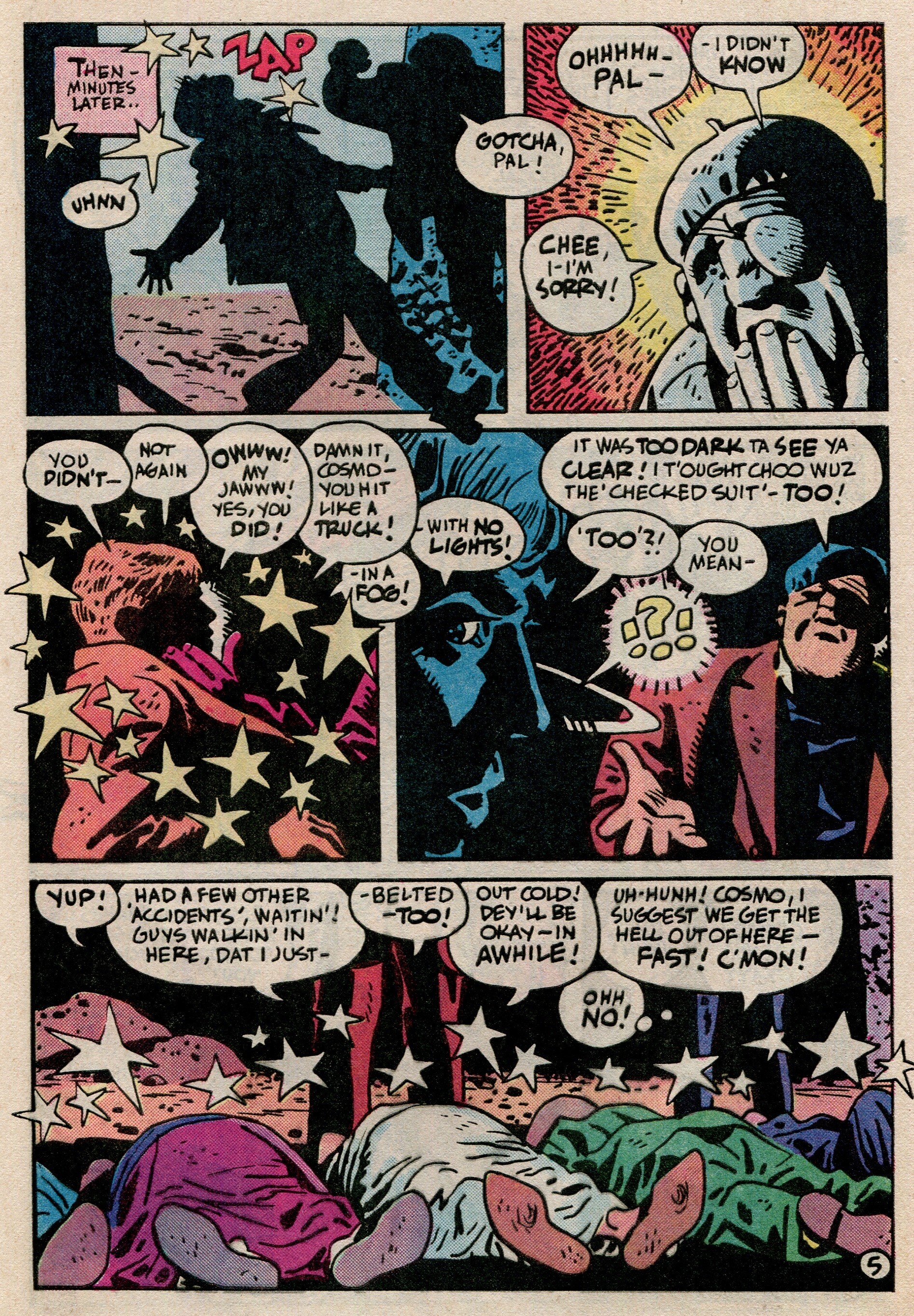
The words in the story become less relevant as his lettering morphs more and more into a design element. The shapes of the speech bubbles and the rhythm in the placement of the narration become more important than what’s being said.
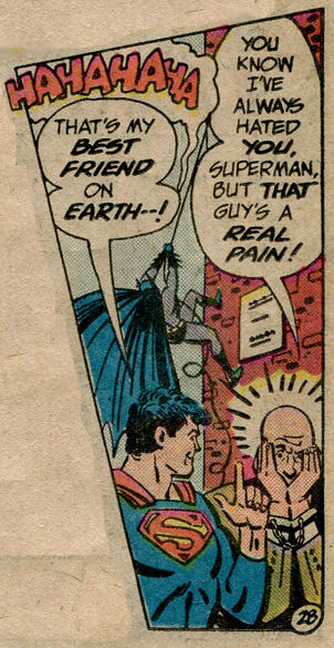
(panel from Superman Annual #9, also from 1983)
Take in the full glory of the image above. I can assure you that, even in context, it’s just as absurd. A cackilng Batman, a grinning, chummy Superman, and a Lex Luthor who looks like a grownup Charlie Brown—what does it all mean? Does it matter, or is it enough for the image to just look striking and nice?
I used to be sad that the world never got a longform Toth story. Didn’t he want to cut loose? Spill his guts for the world? But I don’t think Toth was ever about volume (audible or size-wise). His beliefs were clear and simple, and his style was similarly graceful and trim. Even as mainstream adventure comics in the ‘80s and ‘90s were moving toward full-time glam grunge rock-and-roll showmanship, Toth was content to play the part of your quiet uncle that only shows up at weddings and funerals, dancing his little waltz he’d perfected across the years.
I can’t help but compare it to other mediums—can a well-shot movie save a bad script? If the song is played well, do the lyrics matter? Can a precise artistic vision be reason enough to tell a story, or can style trump substance?