Dear readers,
You have probably noticed that we’ve been silent for a couple of months now. We’ve decided, after long consideration and much bittersweet angst, to retire Hazel & Wren.
This was a very difficult decision, as we hold this Hazel & Wren community very dear. However, due to life commitments for co-founders Amanda and Melissa (starting and running other businesses and art projects, raising kids, and finishing grad school to name just a few), we are no longer able to contribute to this community in the way it deserves. Rather than do a shitty job, we’ve decided to hang up our very fashionable hats… at least for now. We hope you understand.
We are endlessly grateful to all of you who have participated in this online community and/or our in-person events, and to those who have supported Hazel & Wren with time, expertise, partnerships, money, and verbal support. This community literally wouldn’t exist with all of you.
 A special thank you to anyone who has ever volunteered on the Hazel & Wren staff, including our recent/current amazing staff: Aaron King, Cassidy Foust, Taylor Trauger, Joshua Johnson, Liz Lampman, and Jessica Mayer. The warmest of fuzzy thank-yous to Timothy Otte, who was our first and longest volunteer staff member, and our thoughtful Chief Ampersand for five wonderful years. You all have given us so much, and we’re probably going to be forever in your debt, so…
 Here’s a quick glance of the community we’ve built together in the last 6+ years:
*hosted over 15 events/readings/workshops for writers in various stages of their passion/career
*partnered with at least 10 awesome art/lit organizations for said events
*hosted monthly(ish) online open mic sessions for writers to get feedback on works-in-progress
*written hundreds of blog posts geared towards helping writers
*featured over 50 literary industry organizations or individuals through guest blog posts and Writing Life interviews
*have had nine dedicated and talented volunteer staff members/interns over the years in addition to Hazel & I.

Wow. We’ve loved being a part of this friendly, mischievous, intimate, energetic, thoughtful, cheeky community for the last 6+ years. But really: HOW LUCKY ARE WE?!
We don’t want to leave you totally in the lurch, so below you’ll find our last goodbye: a list of books that we think you should add to your reading list, and one final Three Things writing prompt. We’ll also leave our archive of reviews, interviews, prompts, and past Open Mic submissions available for your perusal, for the foreseeable future.
Thank you. We love you all, even more than coffee.
Yours in books & coffee & mischief forever,
Amanda & Melissa
(aka Hazel & Wren)
This is what some of us staffers are currently reading, and that we think you should definitely add to your reading list, like, now. Happy reading, friends.
Lincoln in the Bardo by George Saunders
Everything I Never Told You by Celeste Ng
Hunger by Roxanne Gay
Climate Changed: A Personal Journey through the Science by Philippe Squarzoni
Ramona Blue by Julie Murphy
Saints and Misfits by S.K. Ali
Woman on the Edge of Time by Marge Piercy
Thus Were Their Faces by Silvina Ocampo
Our farewell prompt features three moments in one day. Or, one moment in three days. What tale will you spin?
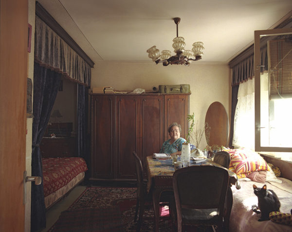
Bogdan Gîrbovan, #06, 5th floor from 10/1 series, 2008. Photograph. www.girbovan.ro

Holly Andres, River Road: Milepost 13 from The Fallen Fawn series. Photograph. www.hollyandres.com

Nishe, Slowly disappearing, 2012. Photograph. Via Flickr.
What We’re Reading: Self-Help Round-Up
I don’t know if it’s just the state of the world, or because I’m going through a breakup, or because all of that is happening all at once in my mid-twenties and it’s culminating in a quarter-life crisis, but I’m all about the get-your-shit-together self-help books these days. So if you, too, are just now realizing nobody ever taught you how to cope with anxiety, depression, heartbreak, political turmoil, environmental catastrophe, and the inevitability of losing everyone and everything in your life—while also somehow being a responsible adult with a good income-to-debt ratio—then I can’t recommend these books enough:
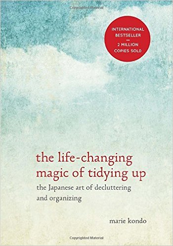 The Life-Changing Magic of Tidying Up: The Japanese Art of Decluttering and Organizing by Marie Kondo (Ten Speed Press, 2014)
I read this book while preparing for a move, and I can’t express how much Kondo’s insights helped me purge my possessions and minimize my lifestyle. If you are surrounded by so many things that you don’t even know what you own or where to find it, this book is for you. Change your life. Get rid of excess. Then get rid of more. Then surround yourself with people and things that bring you joy. It’s worth it.
Best advice: Don’t decide what to throw away, decide what to keep. Only keep things that spark joy, and get rid of everything else. Yes, everything.
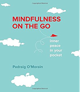 Mindfulness on the Go: Inner Peace in Your Pocket by Padraig O’Morain (Harlequin, 2014)
Great for keeping at your desk or in your bag, this little book can help you find opportunities for cultivating mindfulness at work, at home, on your commute, while waiting, while traveling, and before sleeping. Brief chapters explain why mindfulness helps with managing stress and anxiety while making room for creativity and thoughtfulness. The “on the go” exercises and quick tips are easy to incorporate anywhere, anytime. Spending even one minute focusing on your breathing can go a long way to improving your mind and mood.
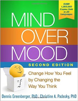 Mind Over Mood: Change How You Feel by Changing the Way You Think by Dennis Greenberger and Christine A. Padesky (The Guilford Press, 1995)
Speaking of your mind and mood—if you are the kind of person who really likes doing their homework, then this workbook is for you. It was created by clinicians over twenty years ago but is still being recommended by therapists today—and for good reason. If you’re willing to take the time to read the lessons and do the exercises, you can create your very own DIY cognitive behavioral therapy practice, which I especially recommend if you are not going to therapy (and I’m the kind of person who will recommend therapy to everyone).
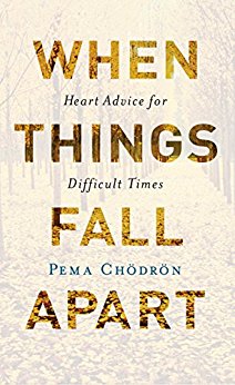 When Things Fall Apart: Heart Advice for Difficult Times by Pema Chödrön (Shambhala Publications, 1996)
Let me take a moment to recommend every single book by Buddhist nun Pema Chödrön. I just think you should start with this one. Written in the wake of her divorce and subsequent spiritual journey, it basically answers the question I’ve been asking myself for months: How do I go on? With advice on acceptance, openness, and compassion—starting with compassion for yourself—this book forces you to look inward and evaluate your habitual patterns, attachments, and addictions so you can let go of your ego and your fixed ideas and learn how to simply be.
Best quote: “Without giving up hope—that there’s somewhere better to be, that there’s someone better to be—we will never relax with where we are or who we are.”
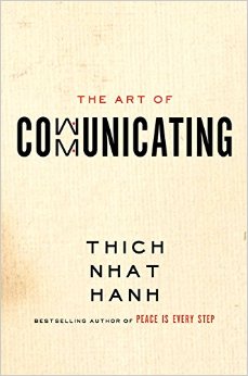 The Art of Communicating by Thich Nhat Hanh (HarperOne, 2013)
Once you’ve learned how to be with yourself and reflect on your feelings, read this to learn how to communicate those feelings more openly and honestly in your relationships, at work, and with yourself. Buddhist monk Thich Nhat Hanh’s succinct, conversational tone makes his writing approachable and easy to digest. So even if Buddhism isn’t really your thing, the advice can guide you toward thinking, listening, speaking, and acting with understanding, kindness, and love.
In honor of all of my fellow mothers out there: let’s all take a little lie down. For a second. Because, let’s face it, that’s all we usually get.
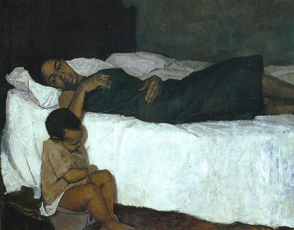
Barrington Watson, Mother and Child, 1958-59. Oil on canvas. National Gallery of Jamaica, Kingston, Jamaica.

David Graeme Baker, July Bride, 2008. Oil on linen mounted on panel. www.davidgbakerpainting.com
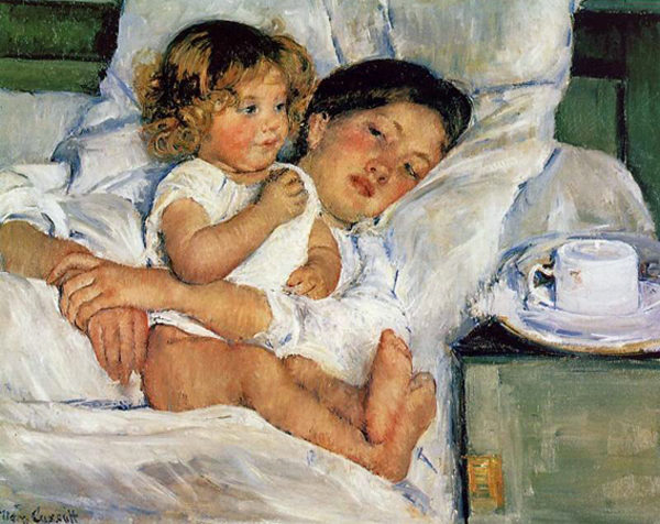
Mary Cassatt, Breakfast in Bed, 1897. Oil on canvas. The Huntington Library, San Marino, California.
As we approach Mother’s Day, let’s focus on the little folks who make mothers what they are: crazy people. Just kidding. But let’s give some young’uns some adventures, shall we?

Angela Strassheim, Untitled (Horses), from Left Behind series. Photograph. www.angelastrassheim.com

Holly Andres, River Road: Milepost 39, from The Fallen Fawn series. Photograph. www.hollyandres.com

Jeremy Geddes, Acedia, 2012. Oil on board. www.jeremygeddesart.com