What We’re (Going to Be) Reading: Autoptic Edition

The Autoptic Festival is this weekend, August 8 and 9. It’s a convention that focuses on prints, comics, and music, and it’s free to attend. MN Artists has an excellent write-up on some of the big-name artists who will be attending, and they’re all excellent choices. Autoptic is a huge festival, though, and there are five other artists whose books I’m looking forward to buying. In no particular order…
 The Suitor by Nicholas Straight
It seems like a lot of Straight’s creative energy has been taken up with a design job, and while it’s always great to see an artist have steady work, I was sad that it seemed to come at the expense of his comics. But I was wrong! The Suitor is debuting at Autoptic, and it looks great.
Straight’s line work is fine and feathery, looking almost like etchings at times. A high level of detail typically contributes to a more static image, but Straight is also great at dropping those lines out when he needs to show movement and action:
.

In addition, the book seems like a generally beautiful object to have around. The die-cut cover (possibly done by hand?) over the pink paper is striking, and the full-page panels give it an “art book” feel and make it easy to browse after giving it a thorough read.
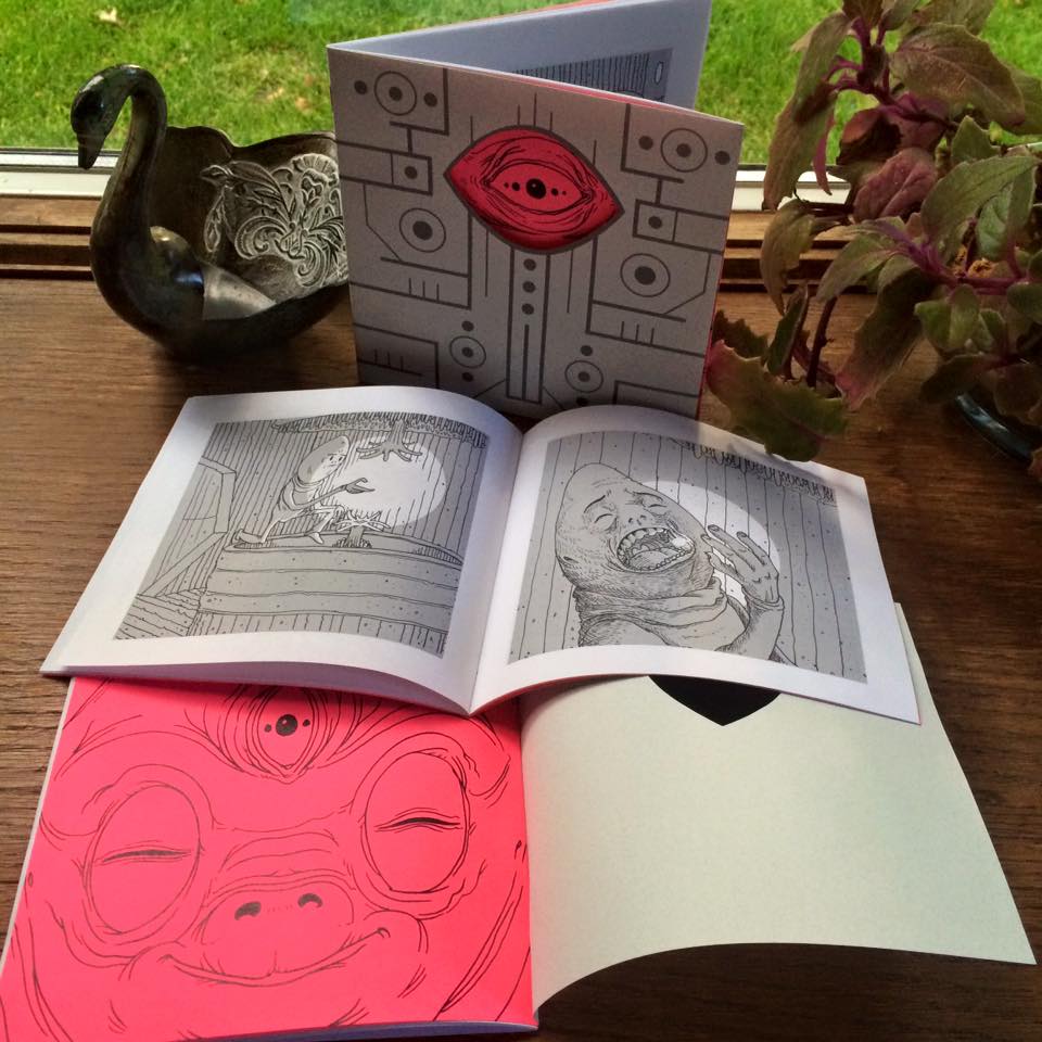
 Ashen by Chase Van Weerdhuizen
It’s a comic so mysterious, I can’t even find the cover! Ashen looks to be a short black-and-white fantasy comic, and while I seriously overdosed on fantasy movies, shows, and novels around the age of 16, I still find delight in taking short dips into made-up worlds. It’s similar to what Kurt Vonnegut said about science fiction: “‘You know, the problem with science-fiction? It’s much more fun to hear someone tell the story of the book than to read the story itself.’ And it’s true: If you paraphrase a science-fiction story, it comes out as a very elegant joke, and it’s over in a minute or so. It’s a tedious business to read all the surrounding material.”
And based on what Van Weerdhuizen has shown so far, he’s going beyond the Tolkienesque tropes of elves and fellowships. The previews I’ve seen seem to echo Greek or Babylonian design, his monsters are fleshy and strange, and his halftones give a feeling of stark, lonely travel. With minimal narration and short dialogue, Ashen looks to be a slow trip through a strange land without any of the expositional baggage of a fantasy epic.
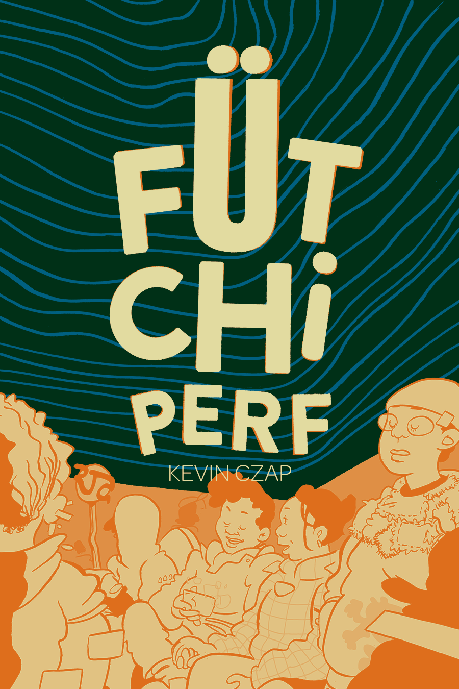 Fütchi Perf by Kevin Czap
I’d only heard of Czap through his co-distribution of the Ley Lines series (one of which I’ve reviewed here). When I saw this preview of Fütchi Perf, it felt more like being swept into a song than reading a comic. Hair and clothes and eyes loop together across establishing shots. Snippets of conversation are spattered across snapshots of hands and mouths.
And those colors!
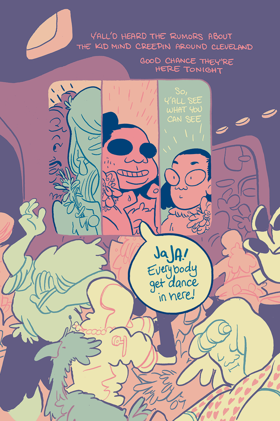
It’s almost a neon pastel aesthetic, I guess, and it works perfectly for what Fütchi Perf seems to be—an album of shorts, with colors playing the roll of instruments, recurring through different songs but playing different notes. That’s a clumsy metaphor, especially next to Czap’s graceful lines, but it seems apt.

Phases by Maddi Gonzalez
I got to see the first few pages of Phases at a reading, and I’ve been looking forward to reading the rest. Gonzalez has always been a brave cartoonist, dealing directly with issues of mental health and representation. Phases looks to be light-hearted, but it’s still an important topic: how we define ourselves and how that definition changes over time.
What stands out most is Gonzalez’s excellent page structures. Here’s my favorite page from what I’ve seen so far.

When looking at pages like these, I try to consider what an artist didn’t do. Gonzalez could have used any number of comic “tricks” to show the passage of time: wide blank space, dense grid of panels with incremental differences, or a lone caption. Blank space is very ambiguous, though. A grid of incremental panels is more obvious to a reader, but it destroys the juxtaposition of Fairy Queen Maddi with Goth Pokemon Trainer Maddi. As for a plain block of narration, it’s the equivalent of movie voiceover: it gets the job done, but it doesn’t utilize the visual possibilities that make comics different from other media.
For the rest of preview and the option to buy the book as a PDF, check out this post.
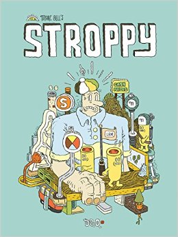 Stroppy by Marc Bell
I initially only knew of Bell as the editor of Rudy by Mark Connery (which was probably my favorite book of 2014). That’s what led me to this conversation between the two about Bell’s new book, Stroppy.
The general aesthetic of the book looks great—a mix between Segar’s Thimble Theatre or Gray’s Little Orphan Annie, manic crosshatching like a ’60s underground, and bright, flat colors that feel like they came out of a Joost Swarte book. Here’s a sample from the publisher.
Bell recently did a reading at Magers & Quinn, but if you weren’t lucky enough to see him, he’s a late addition to the Autoptic bill, joining dozens of talented artists. Who are you going to see?